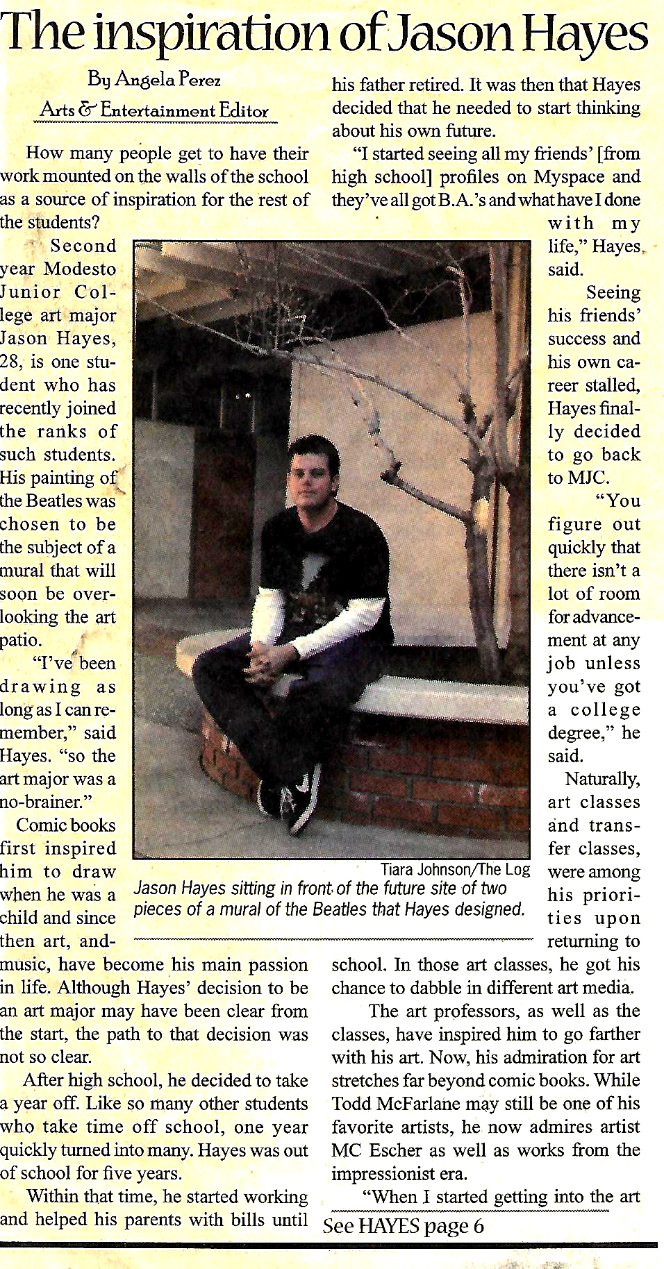
If there’s a project I did at MJC that really got any sort of recognition, it’s probably the painting I did of the Beatles. Everything I’m about to say, I don’t say for the sake of bragging; it’s just the way things played out.
I had taken Color & Design with Prof. Duchscher. During the first week of class, Prof. Duchscher was going over his syllabus. He was talking about his grading system, and mentioned that he was very particular (which proved to be true). He said the major projects would be worth 100 points, and not to be offended if he we didn’t get perfect 100’s on them, because, in the 20 or 30 years he had been teaching there up to that point, he had only given out about 7 or 8 100’s. He would likely take off a point here, and a point there for small details, and that a 97 was still a very good score. I was (and AM) somewhat of a perfectionist with my art, so, of course, I wasn’t aiming for 97; I was aiming for 100.
I know for a fact that there were students in the Color & Design class who went into it thinking they would be able to skate through it, and that the assignments would be amateurish and easy. A lot of these students ended up dropping the class, and probably couldn’t stand Duchscher because he was so particular. I can think of one student, in particular, who thought he was hot stuff because he was able to make money on the side as a tattoo artist, and figured he would ace every assignment. By mid-terms, he was failing, and thought Duchscher was a fool. Unfortunately, while the student was very good at small details, he was not very good at working within time constraints or finishing out a project, and Duchscher called him on it. The student dropped the class and proclaimed loudly upon leaving that he didn’t need the class. I don’t consider that a reflection on tattoo artists, in general; some of them are amazing. This particular young man was simply not open to instruction.
Personally, I didn’t think I was going to like Duchscher very much from the first week of class. By the end of the semester, he was one of my favorite professors. He had said he hardly ever gave out perfect scores, yet I managed to get 2 of them before the semester was over; one was for a project about different line-types in ink, which I will post later, and one was for this Beatles assignment.
I painted the Beatles for our final project. The guidelines were to do four separate-but-related images for a composition to be painted in gouache. Each of the four separate images was to be done in a different color scheme; one monochromatic, one of related colors, one with complementary colors, and one with a triadic color scheme.
My initial impulse was to paint my best friend and his three sisters for the project, but getting each of his sisters to take a photo for the project by the due date would have been next to impossible, as the sisters were constantly on the go. So I started thinking of what else I could possibly do, and my mind went to my favorite band, the Beatles, and my favorite album of theirs, the White Album. On the inside album lining are portraits of John, Paul, George, and Ringo in black and white. I took the black and white images, and worked out my color schemes over them. I chose monochromatic for John, and went with blue on the hue, simply because of the sheer loneliness in Lennon’s voice. This would be especially true on his early solo albums, on songs like, “Mother,” but it was already true in 1968, when the White Album was released. By contrast, Paul McCartney’s voice always sounded warmer, so I went with a warmer tone for his image, and gave him the related color scheme, using red, red-orange, and orange. I went with the complimentary color scheme for George Harrison, and chose purple and yellow for two reasons: 1.) Purple and yellow were complimentary colors that I hadn’t used anywhere else in the first two images, and 2.) The yellow background behind George would give the image a very bright, warm quality, which, below the cool blue of John and catty-corner to the warmth of Paul, I felt would give the composition a good balance. The last image, of Ringo, was going to be triadic, and I had to think good and hard about how to approach it, because I wanted it to have a cooler feel, to balance the composition catty-corner to John, but I didn’t want to use colors that had already appeared in the painting before, and I didn’t want to use primary, or even secondary colors, because I felt like doing a red/blue/yellow or an orange/green/purple would be too predictable. What I ended up going with was a blue-green, red-violet, and a yellow-orange. The colors ended up giving the final image the appropriate psychedelic feel, as well.
I worked right up until the time deadline before submitting it. The fact that it was in gouache meant that it dried relatively quickly. It sat in Duchscher’s office overnight while he graded the assignments, and, when I got it back, I had scored a second perfect score out of the class. Considering the work I put into it, I was pretty excited about the grade.
What I was unaware of at the time was that, while it sat in Duchscher’s office, another of the faculty, Prof. Barr, a painting teacher, had seen it. She would be teaching a mural painting class the following semester, and had been trying to figure out what subject to use to paint as a mural across the front of the staff office building for the Music and Art departments. The building sat directly between the Art building and the Music building, so she was looking for a subject which would bridge the two, and my painting seemed to fill that description. She came to me asking if I was okay with it, and if she could borrow the painting for a while for her students to use as reference. As they painted, the came to me a couple times with questions about my paint choices, as far as which colors I used. It probably frustrated them some when I told them I had mixed all the colors from red, yellow, blue, black, and white, and that there were no other “tube” colors involved.
While the mural was being painted, the MJC newspaper, the Pirates Log, did a story or two on the mural, mainly about the painters in that class. They did eventually come to me about it, though, and wrote an article, so I at least have SOME proof that my painting was the original basis for the mural that now adorns the Art and Music offices.